

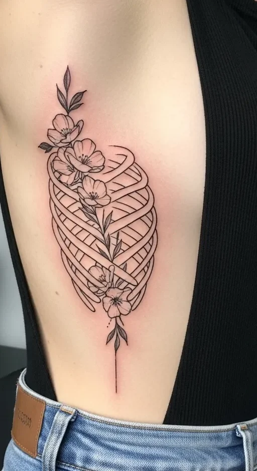
Rib tattoos have a natural way of following the body’s shape. That’s what makes them so appealing. The ribs create a built-in flow, perfect for designs that feel graceful and personal. Whether you like minimal lines or soft floral details, rib tattoos can look refined without feeling heavy. This guide shares rib tattoo ideas that work with your curves, feel wearable, and stay realistic for everyday life. Each idea focuses on simple design choices, budget-friendly planning, and styles that age well.
1. Fine Line Floral Stem
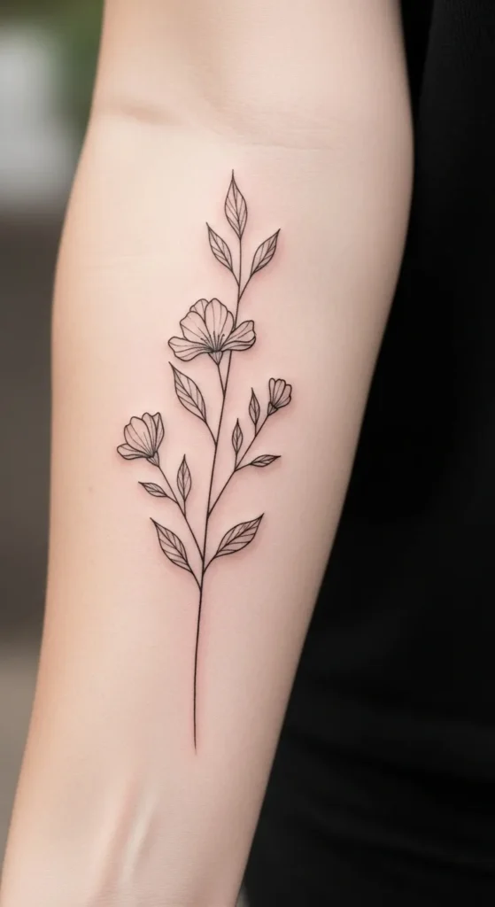
A fine line floral stem fits ribs beautifully. The long, narrow shape matches the body’s curve without forcing the design. Choose a single stem with small petals for a clean look. This keeps sessions shorter and costs lower.
If you want to test the idea, draw the stem with a washable pen first. Adjust placement while standing and sitting. That helps avoid awkward bends later. Black ink holds up well and avoids extra color fees.
Ask your artist for simple line weight. Thinner lines look gentle and stay flexible with movement. Avoid heavy shading. It adds time and expense. This style works well for first-time rib tattoos and heals smoothly when kept simple.
2. Minimal Crescent Moon
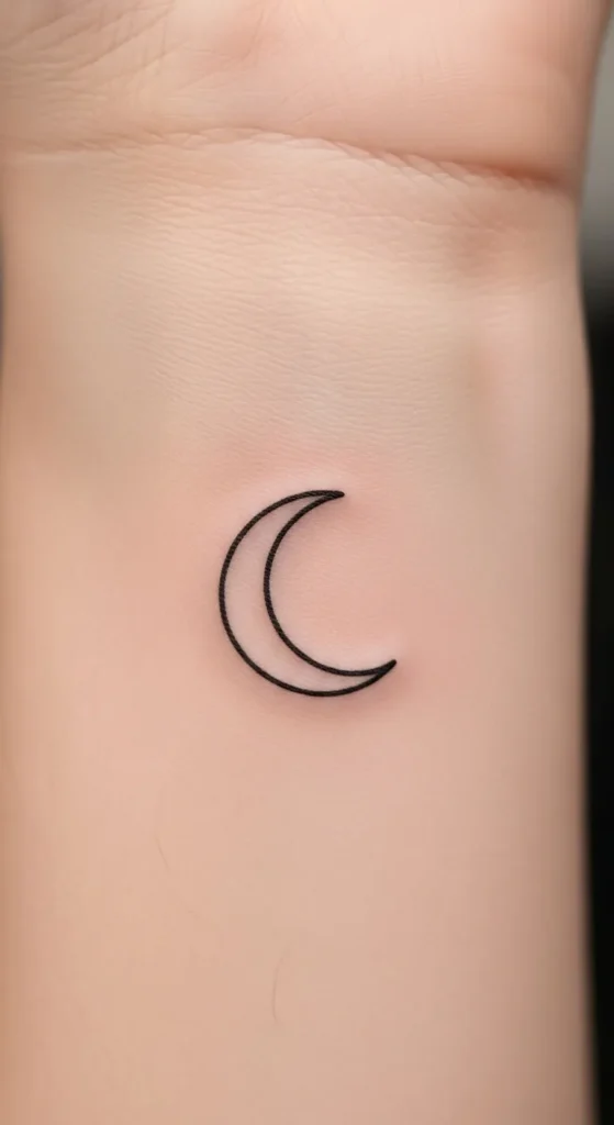
A crescent moon adds quiet charm to the rib area. Its curve mirrors the body, which makes it feel natural. Keep the outline thin and skip extra details.
This design works best placed slightly under the bust or along the side waist. Both spots keep the moon from stretching too much. For a budget-friendly option, go with a single outline and no shading.
You can sketch the moon size on tracing paper and tape it to your side. Move around and check the shape in the mirror. That small step saves regret later. Simple moons heal faster and stay clear over time.
3. Script Word Along the Rib Line
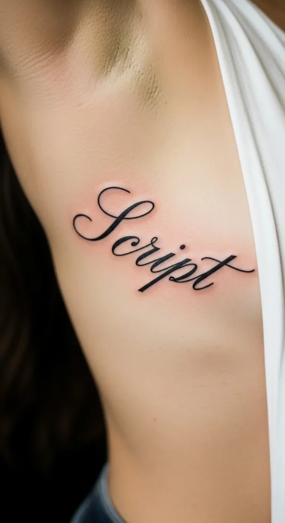
One meaningful word can say plenty. Script along the rib line follows your natural shape. Choose a font with smooth curves and even spacing.
Avoid fancy loops that blur over time. Clean handwriting styles age better and cost less to apply. Short words also keep sessions brief.
Before committing, print the word in different sizes. Tape each version to your ribs. Check it from different angles. This helps find the best flow. Black ink keeps the focus on the word and stays readable as years pass.
4. Single-Line Rose
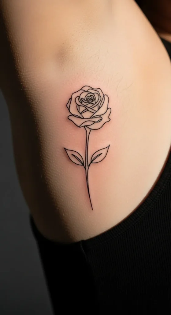
A single-line rose looks graceful without feeling heavy. The continuous line moves naturally with your body. It’s a smart option if you like florals but want restraint.
This design keeps cost down since it uses one needle style and minimal time. Ask for a thin line to keep it light.
Try placing the rose bud near the upper ribs with the stem trailing down. That placement supports the body’s curve. Keep the rose simple. Extra petals add cost and clutter.
5. Vertical Quote Fragment
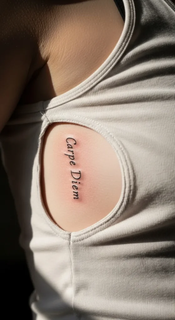
Short quote fragments work well on ribs when placed vertically. Think two or three words max. Vertical placement reduces distortion when you bend.
Choose a clean font. Avoid tiny letters that blur. Bigger spacing helps long-term clarity.
To save money, skip decorative symbols. Focus on text only. Write the phrase on paper and hold it against your side. Adjust spacing until it feels balanced. Simple layouts keep the look calm and readable.
6. Delicate Vine Outline
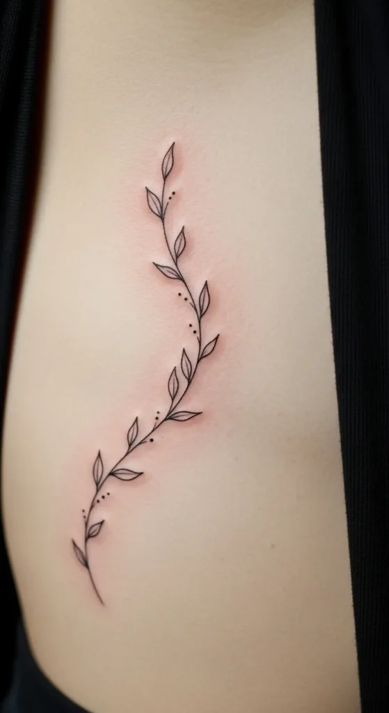
A vine outline naturally wraps along ribs. Small leaves add interest without weight. Keep the outline light and even.
This design lets artists work quickly, which lowers cost. Ask for consistent spacing between leaves to avoid crowding.
If you’re unsure about size, start smaller. Vines can always extend later. That makes it a flexible option. Healing is smoother with fewer shaded areas.
7. Minimal Bird Silhouette
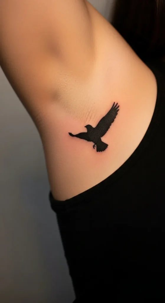
Bird silhouettes feel airy and calm. A single bird works better than a flock for rib placement. It keeps the design clear.
Choose a simple outline with wings slightly curved. That matches the body’s shape. Avoid solid fill. Outlines age better and cost less.
Test placement while raising your arm. This helps avoid warped wings later. Small adjustments make a big difference.
8. Abstract Line Curve
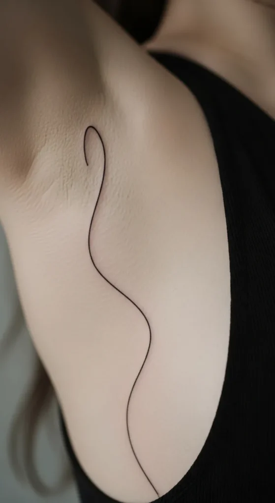
Abstract line curves are modern and subtle. One flowing line can follow your ribs without telling a story. That’s part of the appeal.
This option is budget-friendly since it’s fast to apply. Ask for a smooth, confident stroke.
Draw several versions on paper. Choose the one that feels natural against your side. Less planning time still brings strong results.
9. Small Heart Outline
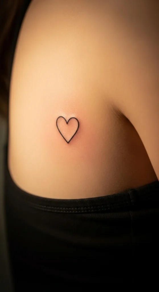
A heart outline adds quiet emotion without feeling loud. Keep it small and simple.
Place it slightly toward the side waist. That area moves less. Avoid shading to keep costs down.
Sketch the heart yourself first. Imperfect hearts often feel more personal. Simple designs heal evenly and stay crisp.
10. Botanical Leaf Pair
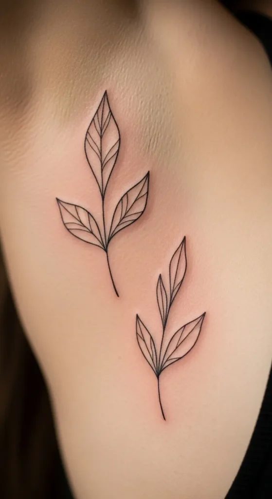
Two leaves create balance without bulk. Keep them slim and lightly spaced.
This design works well for short sessions. Ask for clean outlines only. Skip color to keep things simple.
Leaf shapes flow well with ribs and suit many body types. Test placement while twisting slightly to see how it moves.
11. Tiny Star Arc
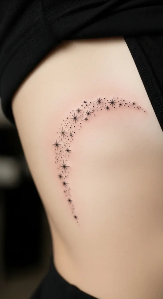
An arc of tiny stars follows rib curves nicely. Keep the stars small and evenly spaced.
Avoid heavy fill. Outlines keep the look light. This design allows easy spacing adjustments during the session.
You can start with three stars and add more later. That spreads cost over time and keeps options open.
12. Minimal Wave Line
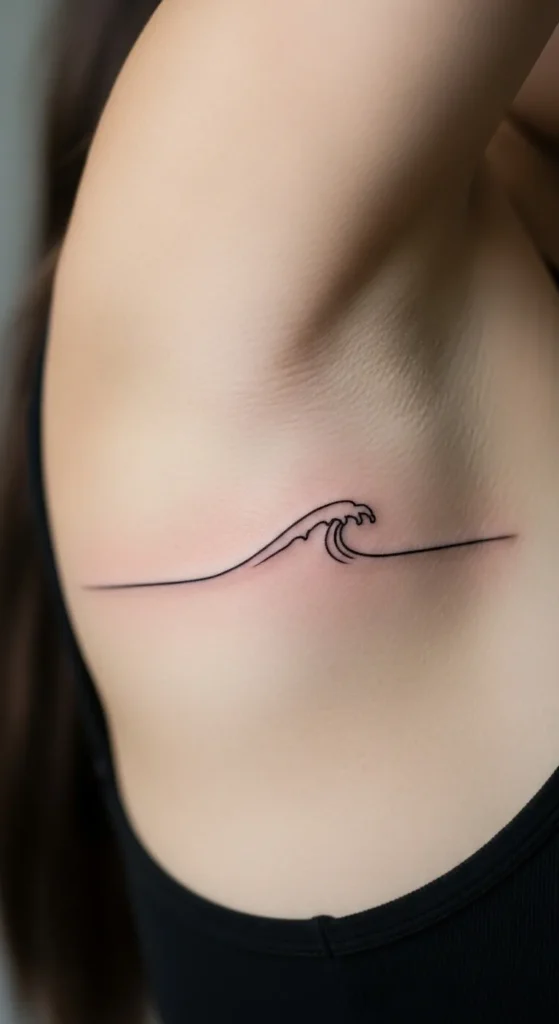
A single wave line adds flow without detail overload. The curve matches ribs naturally.
This is ideal for first-time rib tattoos. Fast sessions mean lower cost. Keep the wave smooth and thin.
Practice drawing the wave on paper. Choose the version that feels calm and balanced. Simple waves age well.
13. Roman Numerals Strip
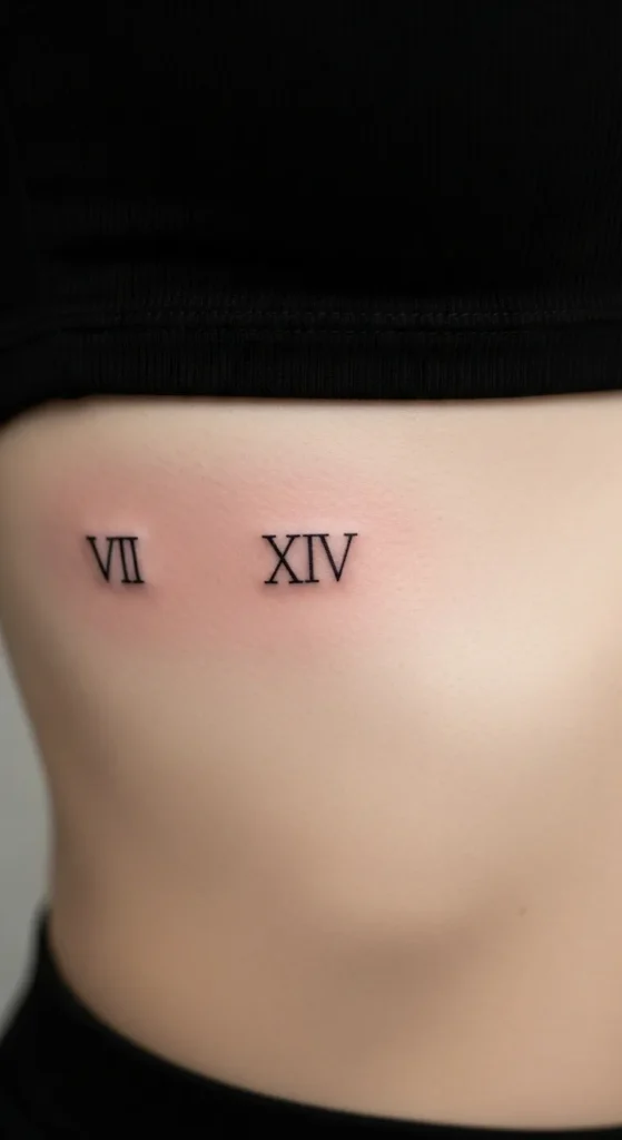
Roman numerals feel personal and structured. Keep the font clean and evenly spaced.
Avoid tiny numerals. Slightly larger text stays readable. Vertical placement reduces stretching.
Print the numerals and tape them to your side before booking. That step saves time and stress.
14. Small Angel Wing Outline
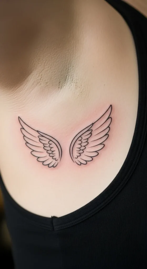
A single wing outline feels symbolic without being heavy. Keep feathers simple.
Ask for thin lines and no shading. This shortens sessions and lowers cost.
Place the wing slightly angled to follow your ribs. Straight wings can look stiff on curved areas.
15. Minimal Sun Outline
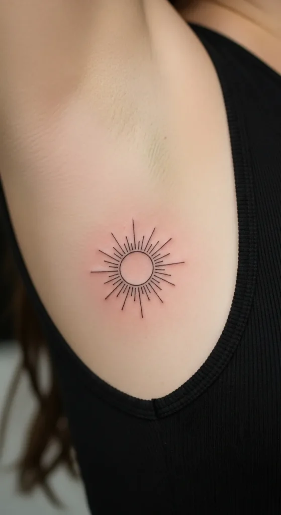
A sun outline adds warmth without detail overload. Keep rays short and evenly spaced.
Avoid filled centers. Outlines heal cleaner. This design stays readable with time.
Test the sun’s size with a pen first. Small changes in size can affect balance.
16. Handwritten Initial
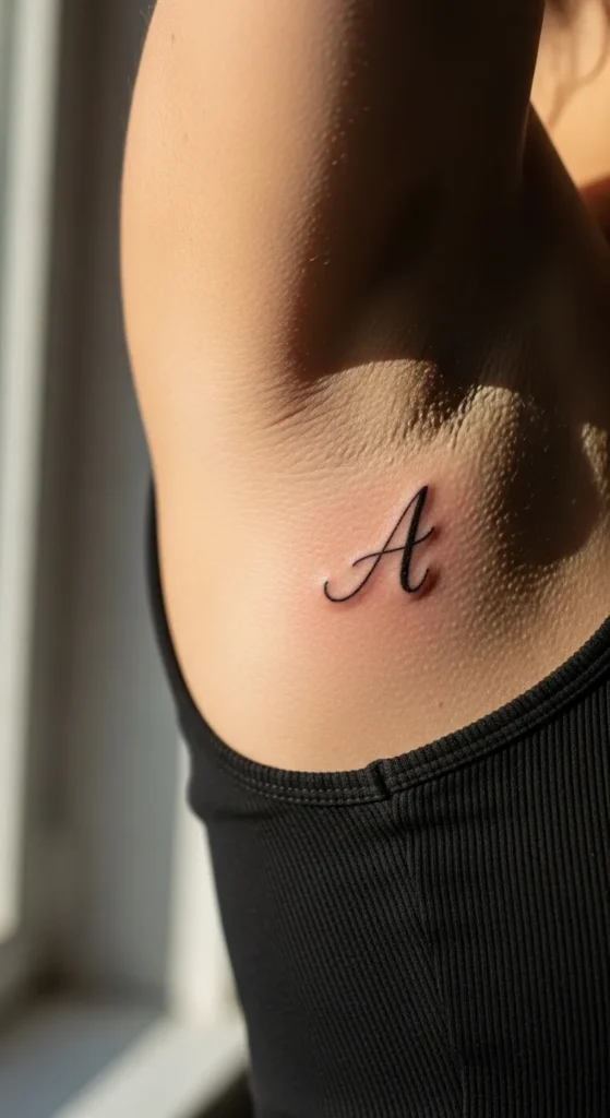
One handwritten initial feels personal and subtle. Choose a natural writing style.
Avoid sharp angles. Soft curves suit ribs better. Black ink keeps costs lower.
Practice writing the letter several times. Pick the version that feels natural before showing your artist.
17. Simple Arrow Line
A simple arrow line feels clean and directional. Keep it slim.
Avoid heavy arrowheads. Clean lines age better. Place it along the rib curve for flow.
This design works well for quick sessions. Planning is simple and affordable.
18. Minimal Butterfly Outline
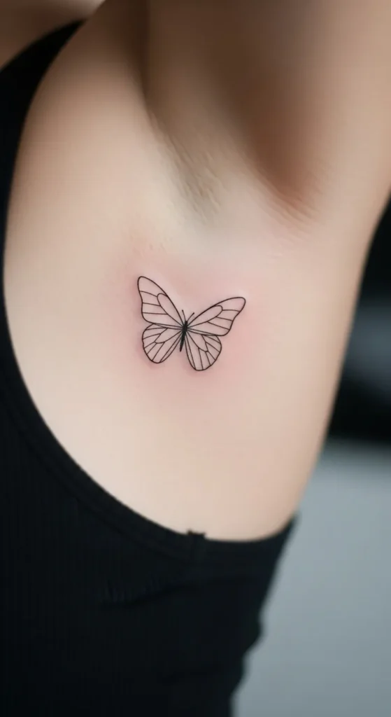
A butterfly outline adds softness. Keep wings open and simple.
Avoid shading to keep healing easy. Thin lines feel lighter on ribs.
Test placement while moving. Wing angles matter more on curved areas.
19. Tiny Cross Line
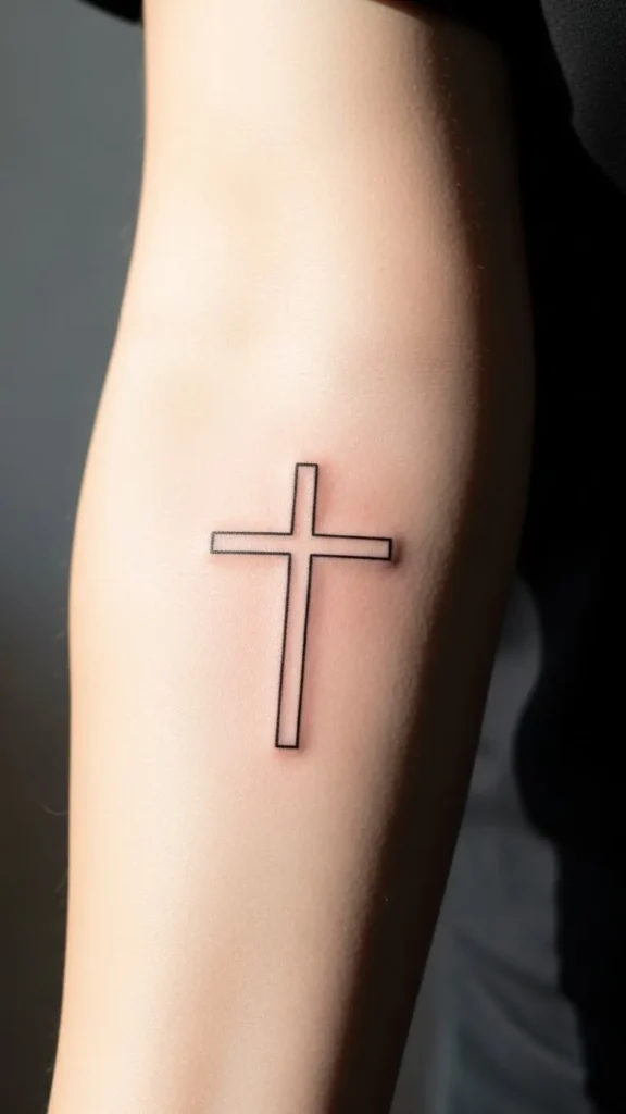
A tiny cross line feels quiet and meaningful. Keep proportions balanced.
Thin lines help with healing. Avoid decorative ends.
Place it where ribs curve gently. That keeps it from warping.
20. Floral Branch Curve
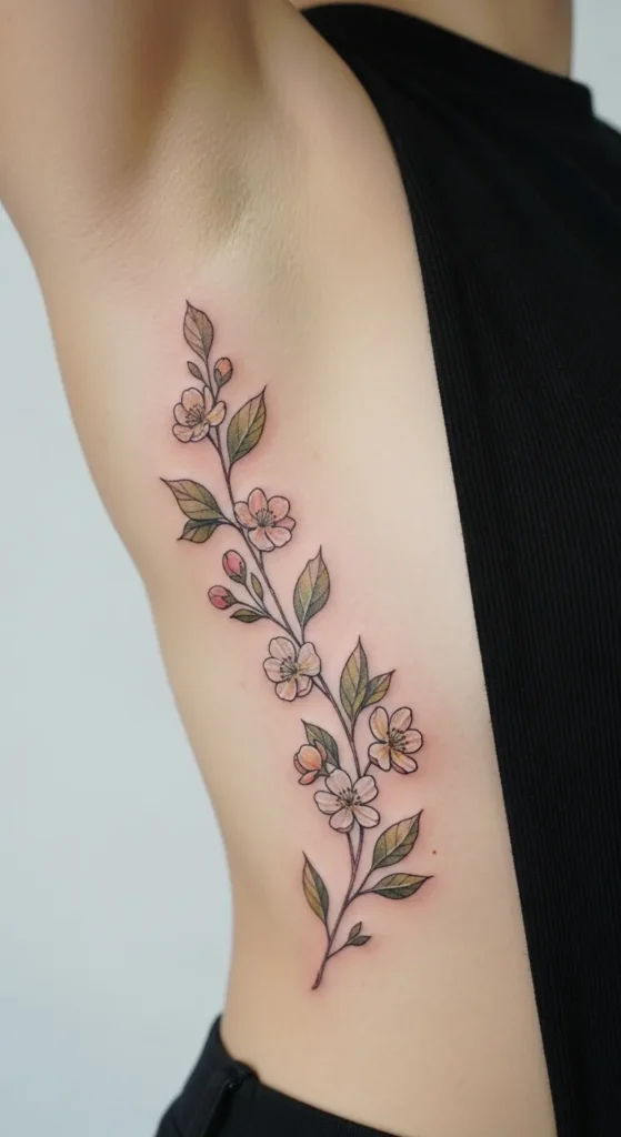
A floral branch adds length without weight. Use few blossoms.
Outline only designs save time and money. Black ink stays clear.
Start short. You can extend the branch later if desired.
21. Zodiac Symbol
Zodiac symbols are compact and personal. Choose a clean symbol version.
Avoid micro sizing. Slightly larger keeps lines clear.
Test placement with a marker first. Balance matters.
22. Minimal Snake Line
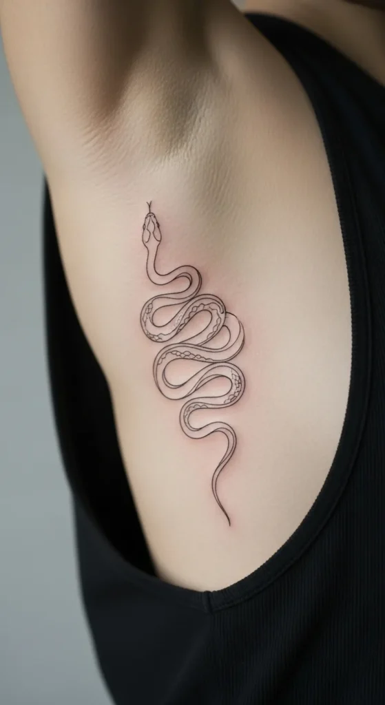
A snake line flows naturally along ribs. Keep the body smooth.
Skip scales to reduce detail. This saves time and cost.
Thin lines keep movement fluid and healing easier.
23. Small Feather Outline

A feather outline feels light. Keep barbs simple.
Avoid shading. Outlines stay clearer over time.
Place it slightly angled to follow your ribs.
24. Constellation Dots
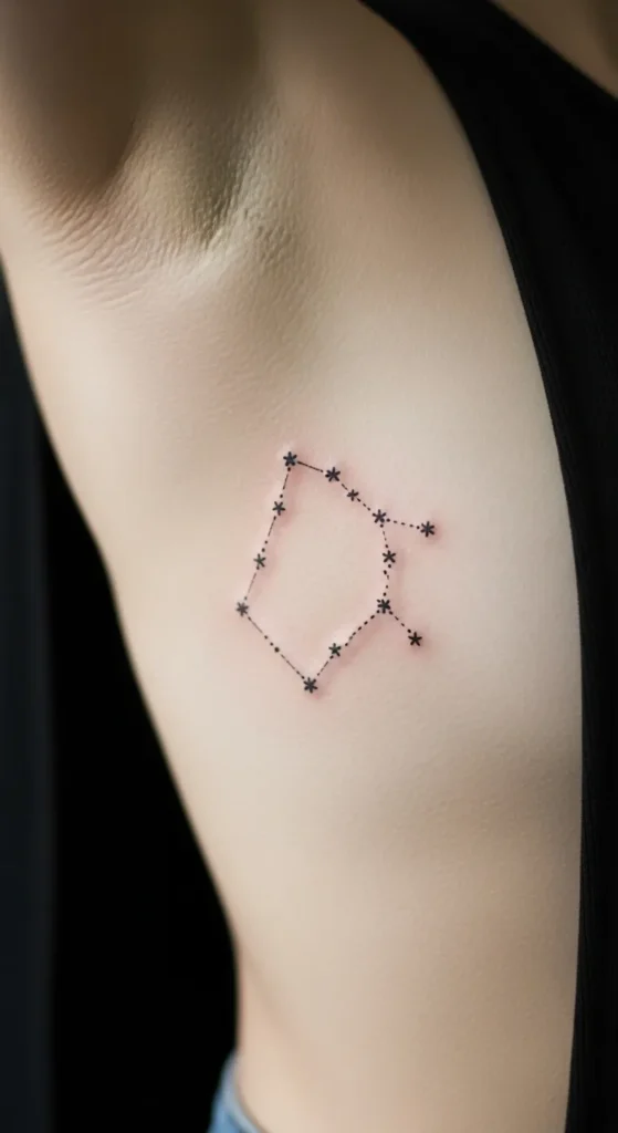
Constellation dots feel subtle and airy. Use dots and thin lines only.
This design allows easy spacing adjustments. Sessions stay short.
Test layout before ink. Balance is key.
25. Minimal Lotus Outline
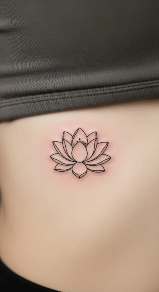
A lotus outline feels calm and balanced. Keep petals symmetrical.
Avoid heavy detail. Thin lines age better.
Center placement helps symmetry on curved areas.
26. Tiny Phrase in Lowercase
Lowercase text feels soft. Keep phrases short.
Choose simple fonts. Avoid tight spacing.
Test size carefully to avoid blur.
27. Abstract Dots and Lines
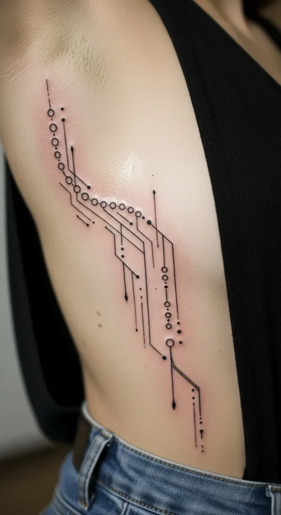
Dots and lines feel modern. Keep spacing even.
This design adapts easily to curves. Sessions stay quick.
You can add later if desired, spreading cost over time.
Conclusion
Rib tattoos work best when they follow your natural shape and stay simple. Clean lines, thoughtful placement, and realistic sizing make a big difference. These ideas show how elegant curves can guide your design rather than fight it. Take time to test placement, keep designs light, and work within your comfort level. When done thoughtfully, rib tattoos feel personal, balanced, and easy to wear every day.

Leave a Reply