

Anchor tattoos have long stood for steadiness, grounding, and staying firm during hard moments. Many people choose this symbol to mark personal growth, loyalty, or a reminder to stay rooted when life shifts fast. The designs can stay simple or carry layers of meaning through shape, placement, and detail. This guide shares strong anchor tattoo ideas that focus on stability without overdoing the design. Each idea includes practical tips, placement thoughts, and affordable ways to plan your tattoo with confidence.
1. Classic Navy Anchor
A classic navy anchor keeps things clear and grounded. Thick lines help the design age well over time. This style works best on the forearm, calf, or upper arm where the shape stays readable. If you want to keep costs low, skip heavy shading and stick to clean outlines. Many artists can stencil this quickly, which helps control session time. Simple line weight also means easier touch-ups later. This design pairs well with personal meaning without adding extra symbols. It stands on its own and sends a strong message of staying steady through change.
2. Minimal Line Anchor
A minimal line anchor is subtle but strong. Thin lines create a calm look that fits wrists, ankles, or behind the arm. This style costs less since it takes less time to ink. Choose an artist skilled with fine lines to avoid blur over time. Negative space helps the shape stay clean. This option works well for first tattoos or quiet personal reminders. The anchor stays symbolic without calling attention from across the room.
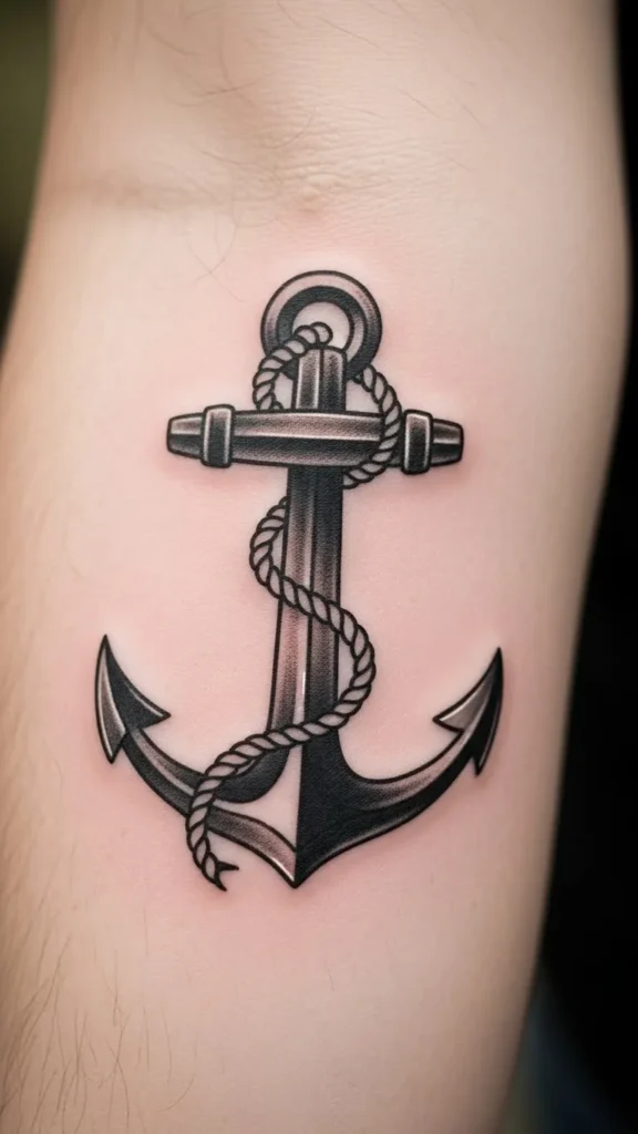
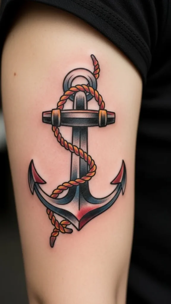
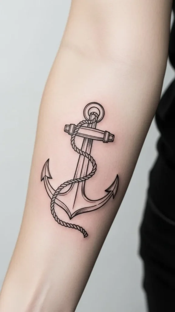
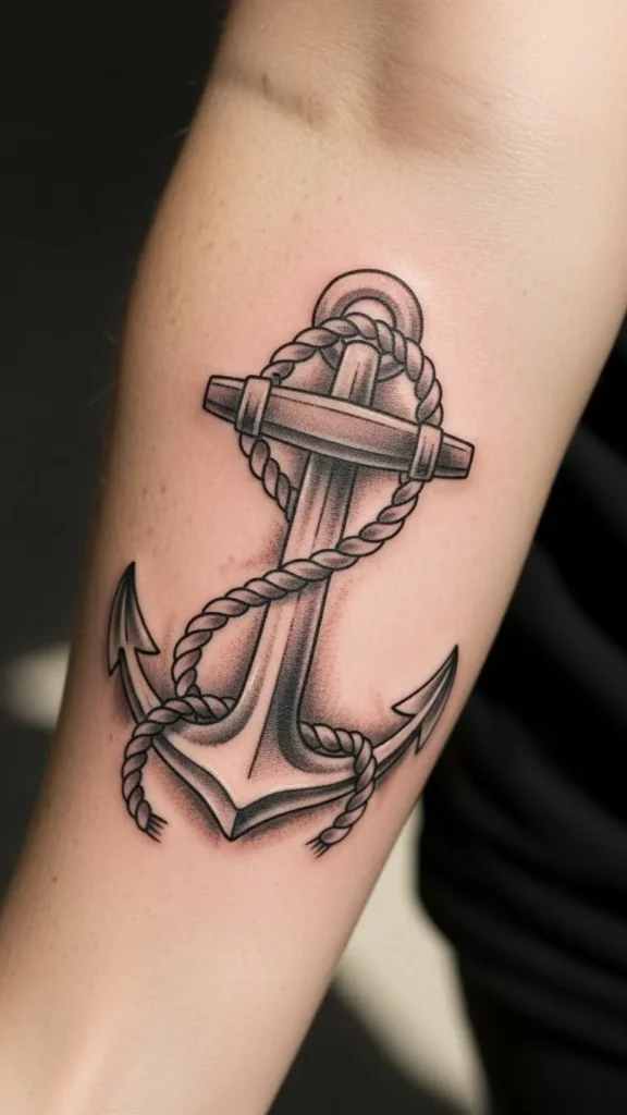
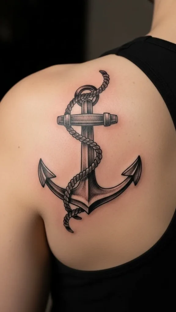
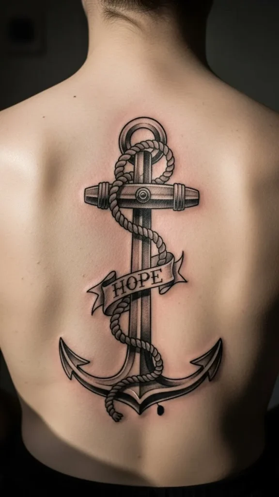
3. Rope-Wrapped Anchor
Adding rope gives the anchor a sense of connection and support. The rope can stand for family, routine, or daily habits that keep you grounded. To save money, ask for light shading instead of heavy texture. Place this design on the shoulder or upper arm for space to show detail. Balanced spacing keeps the rope readable without clutter. This design feels personal without looking busy.
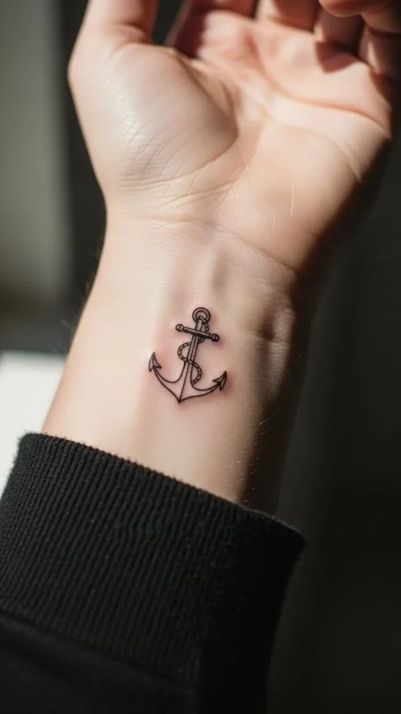
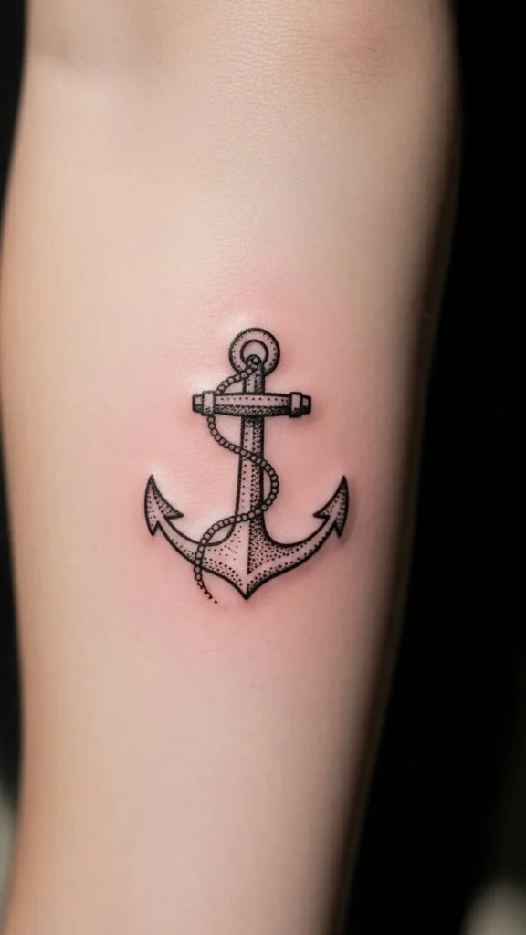
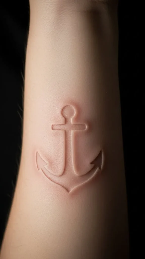
4. Small Wrist Anchor
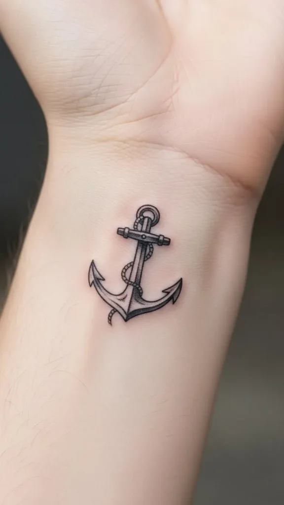
A small wrist anchor works as a private reminder. The size keeps cost down and healing quick. Use bold lines even at a small scale so the shape holds up. Avoid too many details. Strong outline work matters most here. This style fits people who want meaning without large artwork. It’s easy to cover when needed and easy to live with long term.
5. Anchor With Initials
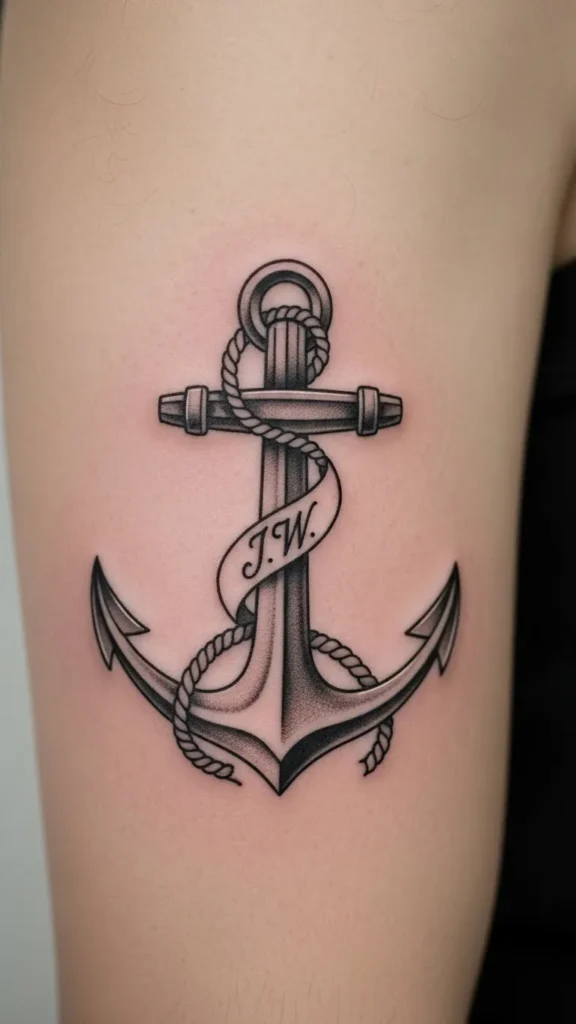
Adding initials personalizes the tattoo without adding clutter. Keep letters small and simple. Avoid fancy scripts that blur. This approach adds meaning without raising the price much. Place it where the skin stays stable, like the upper arm. Simple lettering keeps the focus on the anchor. This works well for honoring loved ones or personal values.
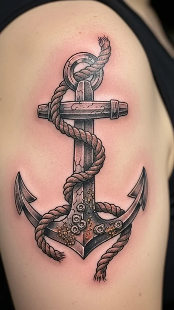
6. Blackwork Anchor
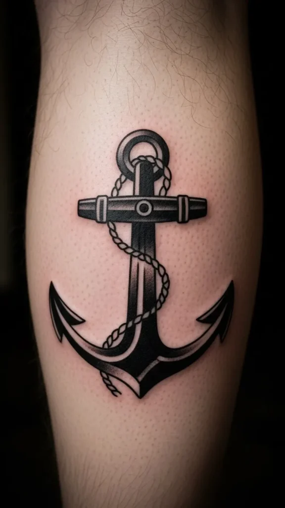
Blackwork anchors feel heavy and grounded. Solid fill holds up over time and fades evenly. This style works best on larger areas like calves or thighs. It may cost more due to fill time, but it reduces future touch-ups. High contrast makes the symbol clear from a distance. Choose this if you want a strong visual statement.
7. Broken Chain Anchor
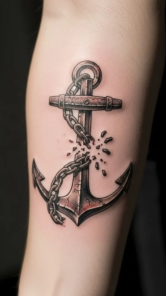
A broken chain shows strength after struggle. Keep the chain simple to avoid clutter. This design fits forearms or upper arms. To manage cost, limit chain links and shading. Clear symbolism carries the meaning without heavy detail. It’s a reminder of holding steady after change.
8. Traditional Sailor Anchor
This style nods to old tattoo traditions. Thick lines and simple colors help it age well. If budget matters, stick to black ink only. Placement on the bicep keeps the shape strong. Classic structure makes this design timeless and steady.
9. Anchor With Coordinates
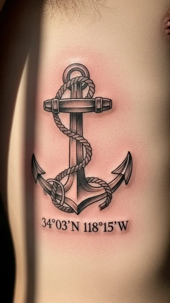
Coordinates mark a place that keeps you grounded. Keep numbers small and clean. Avoid tight spacing. This design stays affordable when kept minimal. Clear number spacing helps readability over time. Choose a flat area to avoid distortion.
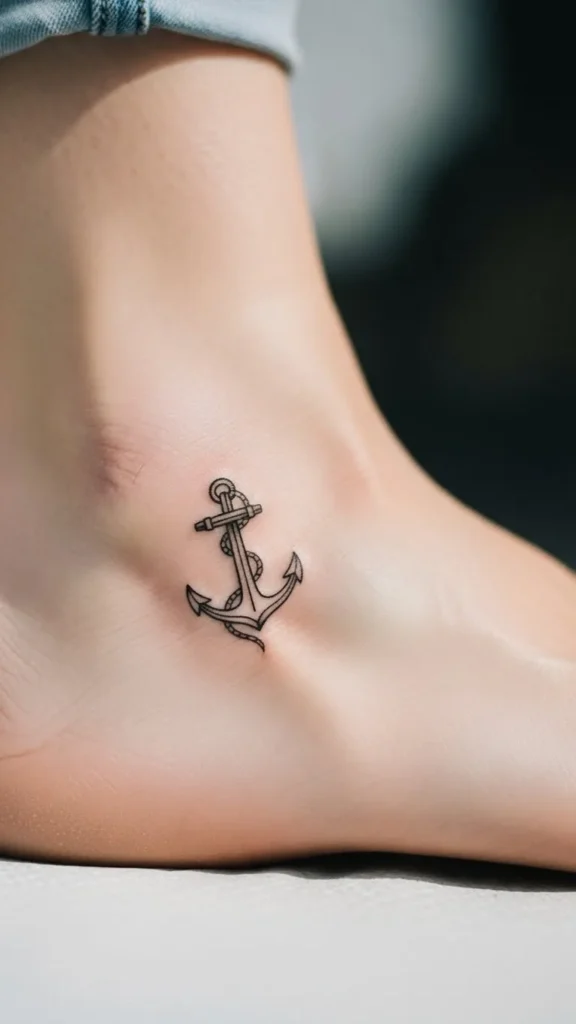
10. Tiny Ankle Anchor
An ankle anchor feels quiet and personal. Small size keeps pain and cost lower. Use simple lines. Avoid shading in tight areas. Compact design helps long-term clarity. It’s easy to hide and easy to care for.
11. Anchor With Date
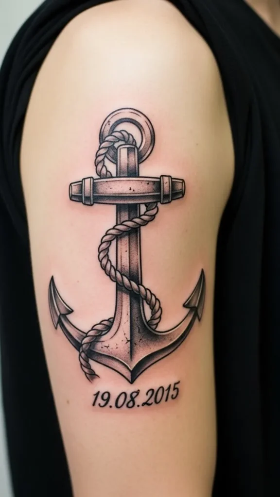
Dates mark moments that changed your path. Use plain numbers and spacing. This keeps the tattoo readable and affordable. Straight alignment avoids visual clutter. This works well for anniversaries or milestones.
12. Double Anchor Design
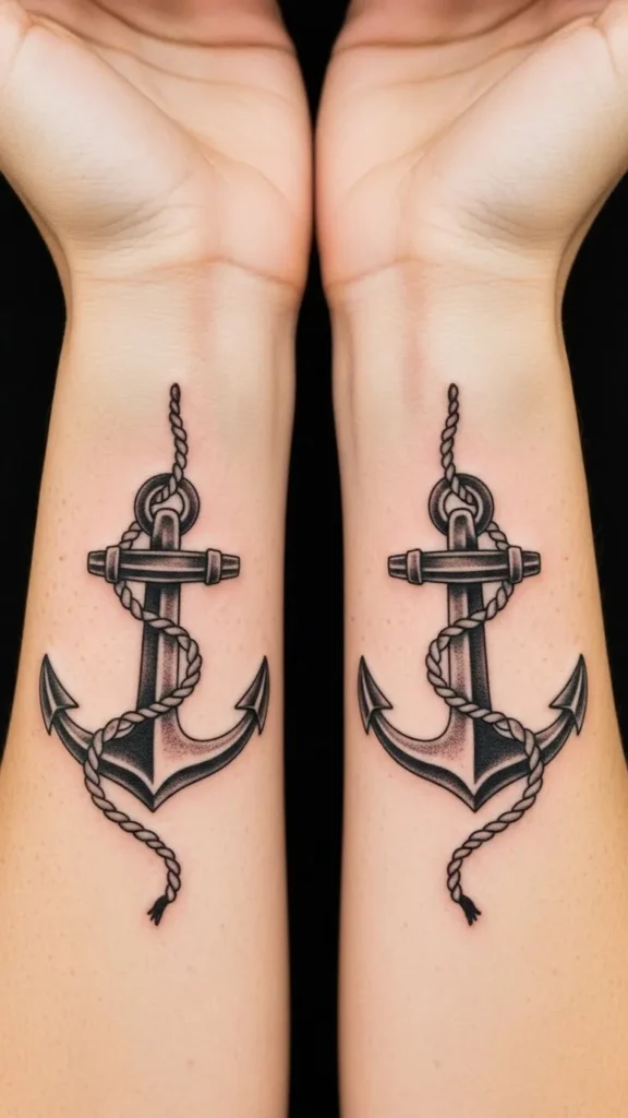
Double anchors can show balance or shared strength. Matching designs cost less when done together. Keep them simple. Mirrored placement adds meaning without extra detail. This style suits close bonds.
13. Anchor With Heart
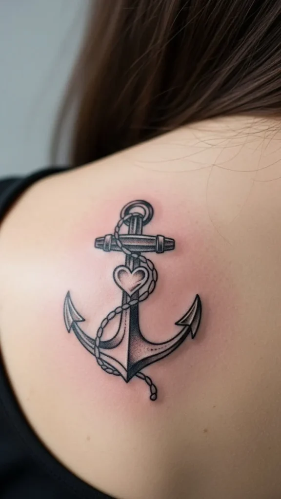
A heart adds warmth to the symbol. Keep the heart small so it supports the anchor. Avoid extra shading. Clean shapes keep the design calm. This fits upper arms or shoulders well.
14. Outline-Only Anchor
Outline designs heal fast and cost less. Bold lines help the tattoo last. This style works on almost any body part. Line consistency matters most. It’s a solid choice for long-term clarity.
15. Anchor With Waves
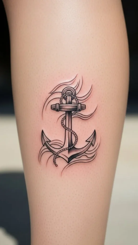
Waves show movement while the anchor shows control. Keep waves simple. Too much detail adds cost. Balanced spacing keeps both elements clear. This design fits larger areas best.
16. Compass Anchor
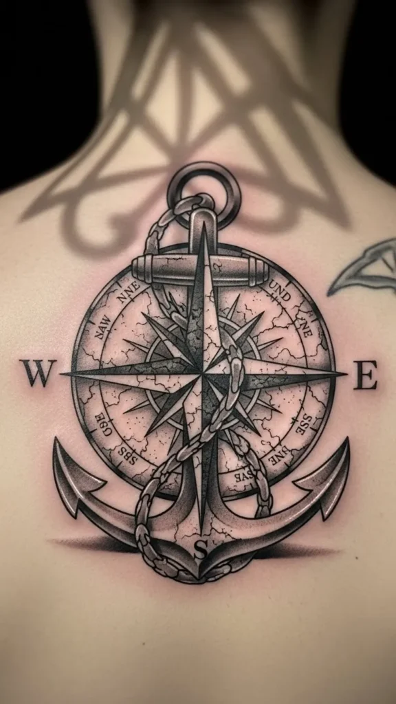
The compass adds direction to the anchor’s meaning. Keep the compass minimal. Skip heavy shading to manage price. Clear geometry keeps the design readable. Upper back placement gives space.
17. Anchor With Roman Numerals
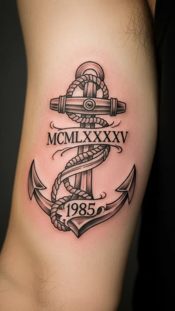
Roman numerals add structure. Keep them clean and spaced. This design stays affordable when kept small. Straight lines matter here. Choose a flat area to avoid distortion.
18. Faded Vintage Anchor
A worn look feels lived-in and steady. Light shading keeps cost down. Avoid heavy texture. Soft contrast helps it age evenly. This works well on arms.
19. Anchor With Name Script
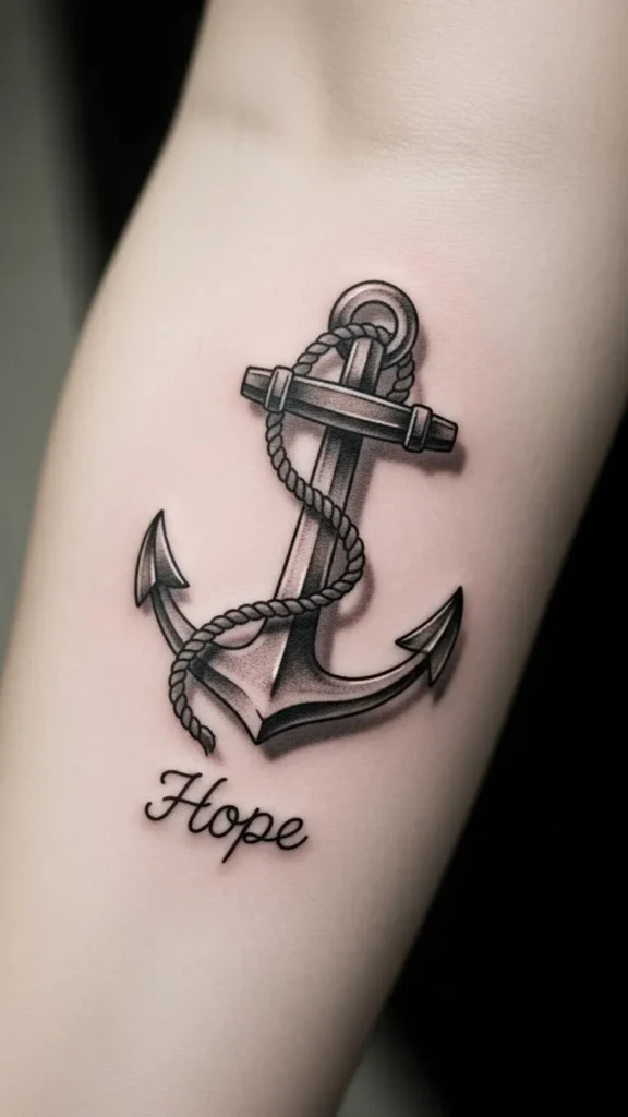
Use basic script fonts for clarity. Fancy lettering fades faster. This keeps sessions short and affordable. Readable lettering supports the anchor’s meaning without overpowering it.
20. Chest Center Anchor
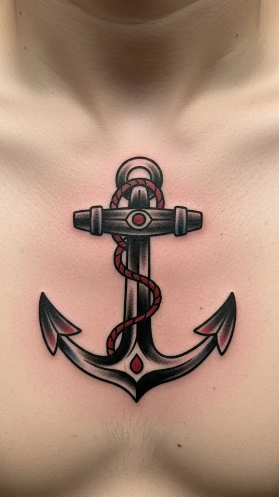
Chest placement feels personal and strong. Keep the design symmetrical. Simple lines help with healing. Centered alignment gives the anchor visual weight without extra detail.
21. Anchor With Circle Frame
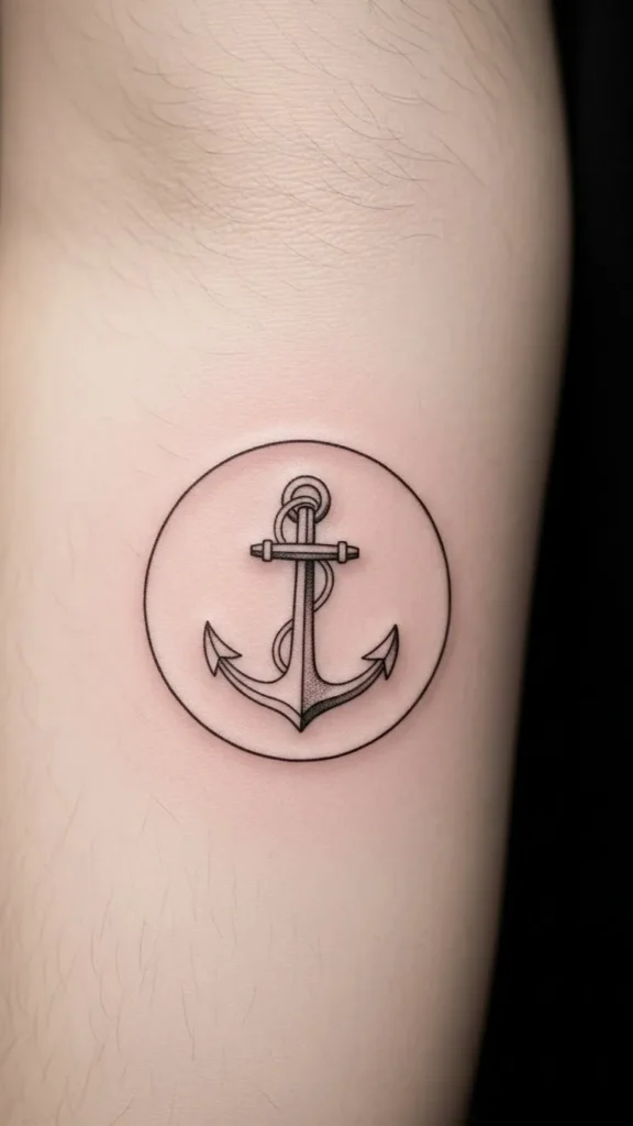
The circle adds unity. Keep the frame thin. Avoid shading. Even spacing helps the design stay clean. This style works well for modern tastes.
22. Hand-Poked Anchor
Hand-poked designs feel raw and personal. They often cost less. Keep it small and simple. Dot consistency matters. This fits minimal styles well.
23. Shoulder Blade Anchor
This placement offers space without constant exposure. Medium size works best. Simple shading keeps cost manageable. Natural placement helps the design flow with movement.
24. Anchor With Laurel
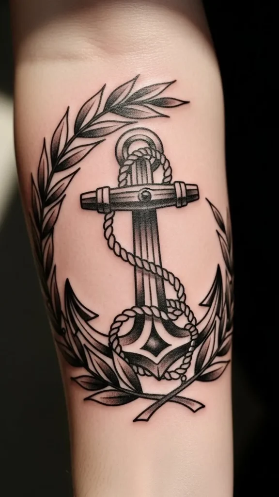
Laurel leaves suggest strength through effort. Keep leaves simple. Avoid tight clusters. Open spacing keeps it readable. Upper arm placement works well.
25. Negative Space Anchor
Negative space designs stand out without heavy ink. This can reduce cost over time. Choose an experienced artist. Clear contrast is key. Best on larger areas.
26. Matching Partner Anchors
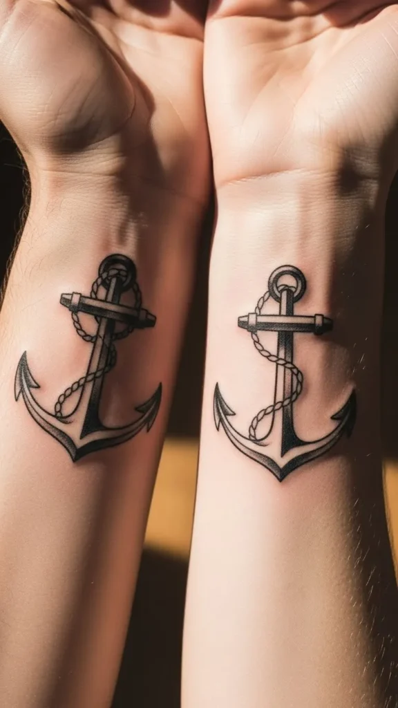
Matching anchors show shared grounding. Simple designs lower cost. Book together to save time. Consistent sizing keeps them aligned in meaning.
27. Anchor With Arrow
The arrow adds direction. Keep it thin. Avoid overlap clutter. Clear crossing point helps the design stay clean. This suits forearms well.
28. Vertical Spine Anchor
Spine placement feels symbolic and private. Keep the design long and narrow. Simple lines reduce pain time. Straight alignment matters most here. This creates a quiet but powerful statement.
Conclusion
Anchor tattoos remain a steady symbol for people who value balance, loyalty, and staying grounded through change. From small line designs to bold blackwork pieces, each option offers a clear way to carry personal meaning without excess. Thoughtful placement, simple structure, and clean line work help keep costs manageable while supporting long-term wear. Choosing a design that fits your story makes the anchor more than ink—it becomes a reminder you carry every day.
`

Leave a Reply